

The best link-in-bio pages do not feel like directories. They feel like small, deliberate homepages: enough context to understand the person or business, enough structure to find the right path, and enough restraint to make the important choices obvious.
That distinction matters because most visitors arrive with very little patience. They may know you from one post, one recommendation, or one search result. Your page has to orient them before their attention moves somewhere else.
A page needs hierarchy, not more links
Adding every available destination can feel helpful. In practice, a long uniform list transfers all of the decision-making work to the visitor. They have to scan, compare, and guess which option matters.
Hierarchy removes that burden. It tells people what deserves attention first, which choices belong together, and what can wait until later. This can be expressed through:
- a concise introduction with a specific point of view;
- one featured action for the current priority;
- grouped products, services, or resources;
- proof such as work, testimonials, or recognizable results; and
- contact options that match how you actually want to hear from people.
A useful page does not make every link louder. It makes every choice easier to understand.
Start with the visitor’s question
People rarely arrive thinking, “I hope there are twelve buttons here.” They arrive with a question. Can I book this person? Where is that product? What kind of work do they make? Is this business right for me?
Your opening should answer the broadest version of that question, then move the visitor toward the most likely next action.
Keep the first screen decisive
On a small screen, the opening should earn its height. A beautiful hero is valuable when it introduces the brand, but less useful when it delays every practical action. Try to make the first viewport communicate identity and direction.
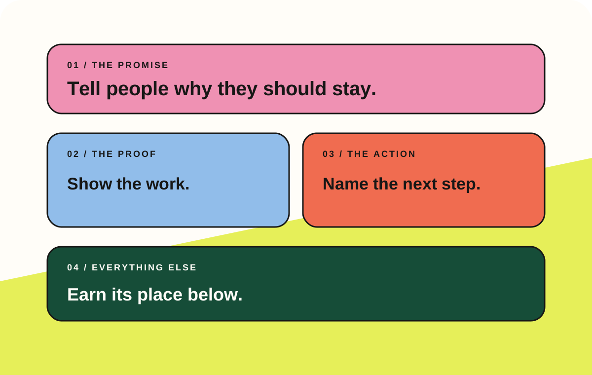
Build the page in four passes
Trying to design and write everything at once makes it easy to polish low-priority details before the page has a clear structure. Work from the most important decision outward instead.
- Write the promise first
Say who the page is for, what you offer, and why someone should keep looking. A visitor should understand the page before they begin scrolling.
- Choose one priority
Give the most valuable current action a noticeably stronger treatment. The rest of the page can still be useful without competing for first place.
- Group the supporting paths
Organize products, services, content, and contact options into recognizable sections instead of one uninterrupted list.
- Remove what has no job
If a link does not help someone understand you, trust you, or take a useful next step, it probably does not need to be on the page.
What changes when the page has structure
The difference is not simply visual. A structured page gives every element a role and makes ongoing updates easier.
| Decision | Crowded list | Useful page |
|---|---|---|
| First impression | A set of destinations | A clear introduction |
| Priority | Every link looks equally important | One action leads |
| Context | Labels do all the work | Copy and visuals explain why |
| Maintenance | New links accumulate forever | Old items are deliberately removed |
You can use the same thinking even if the page is intentionally simple. Three excellent links with useful labels will usually outperform ten vague ones. The point is not to make every page elaborate; it is to make every element intentional.
A small content audit
Before publishing, label each section with one of these jobs:
- Orient: explains who you are or what the page is for.
- Direct: moves someone toward a valuable action.
- Prove: demonstrates quality, trust, or relevance.
- Support: answers a secondary need such as contact or social discovery.
| Ask | Keep it when… | Reconsider it when… |
|---|---|---|
| Does it orient? | It makes the offer clearer | It repeats the page title |
| Does it direct? | It names a real next step | It uses a vague label such as “Click here” |
| Does it prove? | It gives relevant evidence | It exists only to fill space |
| Does it support? | Visitors regularly need it | It has not mattered for months |
Make the next step sound like a next step
Button labels are most useful when they describe the destination or outcome. “Book a consultation,” “Browse the print shop,” and “Download the free planner” reduce uncertainty. “Learn more” and “Click here” make the visitor do extra interpretation.
The surrounding copy can carry the nuance. A short subtitle can explain who an offer suits, what someone will receive, or how much time the action takes.
Publish, observe, then simplify
A link-in-bio page is never permanently finished. Offers change, products launch, and visitors reveal what they actually care about. Review the page regularly, but resist the instinct to answer every new need by adding another permanent link.
Instead:
- move timely campaigns into the featured position;
- retire expired or low-value destinations;
- rename links that receive impressions but few meaningful actions;
- keep frequently used resources easy to reach; and
- check the experience on a real phone, not only a desktop preview.
The goal is a page that stays useful as your work grows. More options are sometimes necessary. More confusion never is.
If the page clearly introduces you, makes one priority obvious, groups the supporting choices, and gives visitors a comfortable way forward, it is already doing more than a list of links. It is becoming a real extension of your brand.