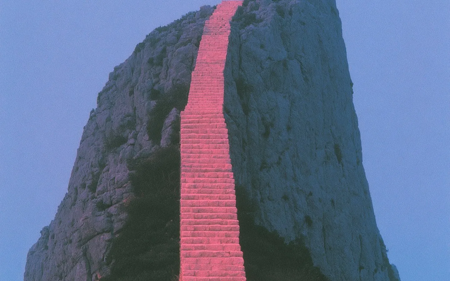

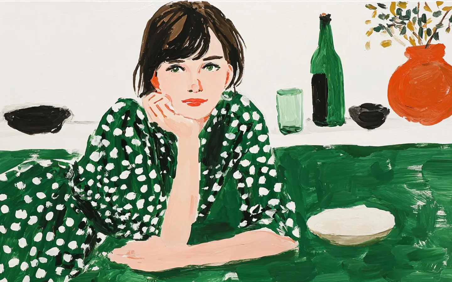
A photographer or visual artist does not need to compress an entire portfolio into a bio page. The page should establish a point of view, offer a few clear entrances into the work, and make the appropriate inquiry path easy to find.
The strongest version feels edited. It shows enough to create interest without turning into a thumbnail archive.
Open with a visual argument
Choose a cover image that communicates the kind of work you want to make more of. A wide environmental frame, a striking portrait, an installation, or a campaign image can establish the world before the visitor reads a sentence.
Pair it with:
- your working name;
- the discipline or role;
- location or availability when relevant; and
- one concise line about the work.
Avoid broad phrases such as “capturing moments” unless the rest of the sentence makes the approach specific. The image already demonstrates that a camera was involved. Use the copy to name the perspective, subjects, or type of commission.
Create a small number of portfolio entrances
Visitors need categories they can recognize quickly. A photographer might use Portraits, Couples and families, Weddings, Documentary, Street, and Motion. An artist might use Selected work, Exhibitions, Editions, Commissions, and Writing.
Do not expose the architecture of your hard drive. Organize for the visitor and the work you want to attract.
If there are many bodies of work, feature the strongest three or four and link to the complete archive. A category can use a representative image, short descriptor, and direct destination.
A visual portfolio becomes persuasive through selection. More images are not a substitute for a point of view.
Show one focused edit on the page
A six-image gallery can establish range better than thirty equal thumbnails. Choose a sequence with variation in distance, color, subject, and pace while keeping the work recognizably yours.
Possible on-page formats:
- Gallery: best for a straightforward selected-work edit.
- Bento: useful when images represent different categories or destinations.
- Carousel: gives each image more space and supports a narrative sequence.
- Cover action: combines one strong image with a commission or portfolio destination.
Use alt text that describes what matters in the image’s context. Captions can identify a project, publication, client, location, or series without turning every image into a paragraph.
Separate admiration from action
Someone may visit to appreciate the work, commission a project, buy a print, request licensing, attend an exhibition, or invite a collaboration. Those are different next steps.
Use specific actions:
- Inquire about a commission
- Book a portrait session
- License an image
- Shop available prints
- View exhibitions and events
- Ask about a collaboration
If one type of work is the current priority, feature it before the broader portfolio.
- Set the visual premise
Open with one excellent image, a clear name, discipline, and a concise description of the work or point of view.
- Create portfolio entrances
Group the work into a small number of recognizable bodies, services, or subjects instead of linking every gallery equally.
- Show a focused edit
Use a short gallery, bento, or carousel to demonstrate range while preserving a deliberate visual sequence.
- Make inquiries specific
Separate commissions, licensing, print sales, bookings, or collaborations when they require different next steps.
- Add the wider practice
Place exhibitions, publications, books, education, tools, and social channels after the core work is understood.
Make the inquiry feel prepared
A generic email icon is useful as a fallback, but a focused inquiry action can improve the quality of the message. Tell visitors what to include: date, location, project type, usage, estimated scope, or timeline.
Do not imply instant booking if the work requires a conversation. “Start a project inquiry” sets a more honest expectation than “Book now” when availability and fit need review.
Include context that strengthens the practice
The lower page can include:
- selected clients or publications;
- an artist statement or short biography;
- exhibitions and events;
- books, prints, or editions;
- behind-the-scenes film;
- workshops or education;
- tools and partner offers; and
- social platforms where the work is actively shared.
Choose proof that supports the intended direction. A long client list is less persuasive than a few relevant names or a project with strong context.
Protect image quality and speed
Prepare images for the component’s actual ratio. Do not stretch small website thumbnails into large cards. Use responsive sources and lazy-load work lower on the page.
The cover deserves priority; the tenth portfolio image does not. A visual page should feel immediate, not punish visitors for the amount of photography available.
A concise working order
- Cover introduction
- Social row, if useful
- Current commission or project priority
- Portfolio categories
- Selected-work gallery
- Proof or context
- Inquiry action
- Wider practice and contact
The order can change with the goal. A print launch may lead with the edition. A wedding photographer may move inquiry and availability higher. A fine artist may prioritize exhibitions and representation.
The page should feel like a confident edit of the practice: one strong opening, a few meaningful bodies of work, and a direct path for the visitor who wants to do more than look.